A vertical graph
Posted on Sun 06 November 2022 in code
Overview
I've been playing with Youtube shorts, which only accept vertical mobile videos. That's a problem for graphs since they're usually wider than they are tall.
So how about a vertical graph? I'm not sure it really works, but it was worth a shot!
The code below generates multiple image files so that you animate the graph! It's all in 9:16 ratio for phones.
The code
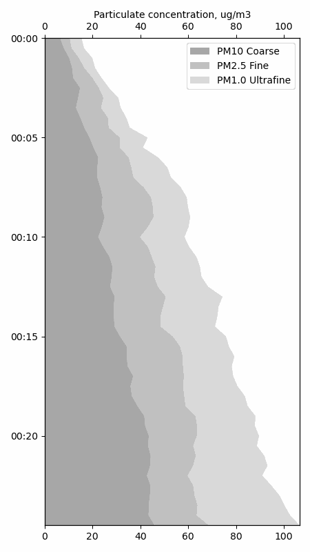
This will generate data and save graphs if you have pandas, matplotlib and numpy.
import pandas as pd
import matplotlib.pyplot as plt
import matplotlib.dates as mdates
import numpy as np
import random

# Generate random data
data = pd.DataFrame(index=pd.date_range(start="2020-01-01", periods=50, freq="30s"),
             data={"pm1":5+np.cumsum([random.uniform(-2, 3) for x in range(50)]),
                   "pm2_5":5+np.cumsum([random.uniform(-2, 3) for x in range(50)]),
                   "pm10":5+np.cumsum([random.uniform(-2, 3) for x in range(50)]),
                   "tvoc":5+np.cumsum([random.uniform(-2, 3) for x in range(50)])})

# Start a plot
fig = plt.figure(figsize=(4.5,8))
ax = fig.add_subplot()

# Prepare out data for stacking
# The .values property of pandas columns accesses the underlying numpy array of
# numerical columns. Numpy arrays can just be added to one another elementwise.
stack_pm10 = data.pm10.values
stack_pm2_5 = data.pm10.values+data.pm2_5.values
stack_pm1 = data.pm10.values+data.pm2_5.values+data.pm1.values

# Call .fill_betweenx() or .fill_betweeny(), depending on your graph orientation, to
# build your stacked line chart
ax.fill_betweenx(data.index.values, 0, stack_pm10, facecolor="#a7a7a7")
ax.fill_betweenx(data.index.values, stack_pm10, stack_pm2_5, facecolor="#c0c0c0")
ax.fill_betweenx(data.index.values, stack_pm2_5, stack_pm1, facecolor="#dadada")

# Move the ticks and labels to the top off the graph
ax.xaxis.tick_top()

# Trim the margins
ax.margins(x=0, y=0)

# To make the y-axis top -> bottom, do this
ax.invert_yaxis()

# Matplotlib has a date formatter for axes, here we set hours:minutes
ax.yaxis.set_major_formatter(mdates.DateFormatter("%H:%M"))

# You can duplicate an axis with .twiny() (not sure why it's .twiny() instead of
# .twinx() here). Then set its limits the same as your original.
ax2 = ax.twiny()
ax2.set_xlim(ax.get_xlim())

# In our case, we want the axis title on the copy (up top), not the original
ax2.set_xlabel("Particulate concentration, ug/m3")

# Create a legend, which will be in the same order as we defined our areas in
# the .fill_betweenx()
ax.legend(["PM10 Coarse", "PM2.5 Fine", "PM1.0 Ultrafine"])

# This removes some of the margins
plt.tight_layout()

# Initial view, no extras
plt.savefig("0_demo.png")

# You can add a line, the v in axvline() means vertical.
# By saving to a different file, we get to keep each version of the graph.
# Update the legend too!
ax.axvline(x=50, color="black", linestyle="--")
ax.legend(["PM10 Coarse", "PM2.5 Fine", "PM1.0 Ultrafine", "Safe level"])
plt.savefig("1_line.png")

# Annotations have a few options for choosing xycoords= and textcoords=
# 'data' is useful for pointing to specific values, while 'axes fraction' is more
# convenient I find for finding an empty spot and putting text there.
ax.annotate('Annotation (00:05)', xy=(0, pd.to_datetime("2020-01-01 00:05")),  xycoords='data',
            xytext=(0.5, 0.5), textcoords='axes fraction',
            arrowprops=dict(facecolor='black', shrink=0.05),
            horizontalalignment='right', verticalalignment='top',
            )
plt.savefig("2_annotation.png")

# You can also afterwards plot another series
# Update the legend (or not) to have it show up there
ax.plot(data.tvoc, data.index)
ax.legend(["PM10 Coarse", "PM2.5 Fine", "PM1.0 Ultrafine", "Safe level", "TVOC"])
plt.savefig("3_extra_plot.png")
To make the animation in pillow,
from PIL import Image

im1 = Image.open("./0_demo.png")
im2 = Image.open("./1_line.png")
im3 = Image.open("./2_annotation.png")
im4 = Image.open("./3_extra_plot.png")
im1.save("animation.gif", save_all=True, append_images=[im2, im3, im4], duration=500, loop=0)